Greetings Annie and Team!
I will start by listing some Invicta Watch Group videos - some of which you may have seen. That client / vendor is the one who has the high octane / hyped promotions with motions graphics and quick edits.
I directed the on location shoot, sourced the b-roll, music, designed the graphics and directed the edit. Went live 10/15/21.
This was a campaign in early September where we put out a new iteration with new watch drops every week for a month. The client wanted different historical footage montages. I wrote the copy, directed the edit, managed the motion graphics work based on PDF’s that came from an agency in the Netherlands.
Another installment of the campaign. Supply chain issues made turnarounds on the animations really tight. We didn’t know what products we would have in time for broadcast - so there was a fair amount of photoshopping on my part to make old watches look like the new ones. I wrote/directed this as well. I did a lot of paring back on the style guide for the motion graphics. Believe it or not - they had even more texture and schematics and words moving about. I think I was able to boiling it down to what was most important without losing the “makers mark” aesthetic.
You’ve seen these but I’m including to have them in one place. I’ve worked with loads of licensed content and strict brand standards. Which in this case (and often) means you don’t have much to work with and you need to insinuate a lot and use what you do have to the best of your ability. I was handed some flat stylized jpegs that were not NFL branded and some logo files that were. The animator and I built the vibes of game day and the excitement of a crowd waiting for the main event with some sound that I designed, power words in the voice over and some cool moving images and stock video.
This animation I illustrated / curated / directed using stock design an existing color pallet and a lot of legal disclaimers.
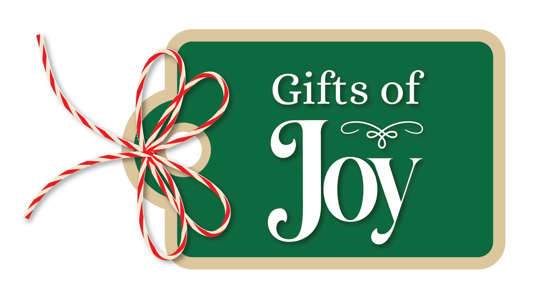
This was a fun exercise with a designer who hopes to be an Art Director. I was handed this video series and a “customer appreciation” logo with a heart - but no strategy as to how to bring that concept to life. I ideated with the designer on ways to manifest appreciation in graphics and motion and how to connect with our customer base. We landed on a faux social media / Instagram feed with a lexicon of light hearted graphics. We designed the graphics piece in tandem and I directed the promo series.
I wrote / directed this promo spot using b-roll from a thousand different places and formats. I also designed the show branding. This went live late September 2021.

Show Branding
This is the start of a new series on a men’s streaming network called “Bulldog”. The initial logo needed to be simple but still exude outdoors without being too on the nose. The “tree” or “ax” was actually from woodworking inlay - but can be used in patterns for flannel clothing promotions, motor cross tire patterns and of course trees / outdoorsiness.
I wrote and directed the stills shoot. We didn’t have video available that day and I don’t mind story telling in still format. I also designed the event branding.

Makenzie-Childs Harvest Fest. Proof that not everything is bright white!


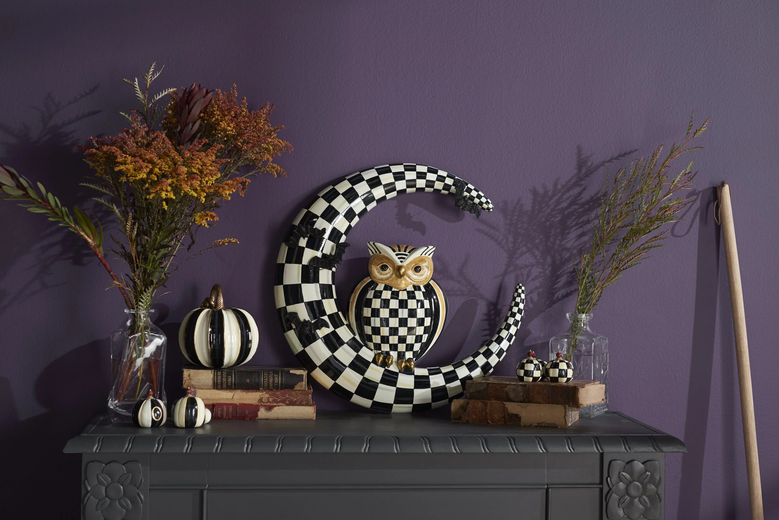


Just kidding. Bright white / yellow. This was an exercise in surveying the market / seasonality and the product set and deciding with an Alfresco in Amalfi vibe. I execute promotions for this client multiple times a month.